반응형
Matplotlib 그래프 한글 깨짐 해결방법
Matplotlib에서 그래프를 시각화 하다보면 아래와 같이 한국어가 깨질때가 있습니다.
그럴때 아래와 같이 코드를 입력하시면 한글 깨짐이 해결됩니다.
import matplotlib.font_manager as fm
font_path = 'C:/Windows/Fonts/malgun.ttf'  # 맑은 고딕 폰트 경로
fontprop = fm.FontProperties(fname=font_path, size=12)
plt.rc('font', family=fontprop.get_name())
더보기
한글 깨짐 코드
import matplotlib.pyplot as plt

# 데이터 준비
data = {
    "미국": [15, 43, 75, 100, 124, 95, 130, 142, 190, 176, 260, 344, 410, 569, 620, 750, 810, 660, 590, 555],
    "일본": [10, 19, 31, 44, 27, 34, 40, 51, 56, 47, 69, 79, 92, 313, 363, 408, 384, 453, 371, 497],
    "유럽": [43, 52, 46, 73, 68, 80, 115, 118, 159, 149, 187, 217, 216, 251, 263, 290, 252, 226, 119, 87],
    "한국": [20, 10, 20, 30, 27, 19, 36, 56, 53, 65, 159, 179, 115, 230, 385, 236, 246, 246, 376, 378],
    "중국": [10, 18, 17, 49, 80, 77, 126, 131, 228, 189, 298, 349, 442, 702, 1308, 1549, 1731, 1704, 1844, 2467]
}


years = list(range(2002, 2022))

# 그래프 그리기
plt.figure(figsize=(12, 8))
for country, values in data.items():
    plt.plot(years, values, label=country)


plt.xlabel('연도')
plt.ylabel('상품개수')
plt.title('연도 (2002-2021)')
plt.legend(title='국가')
plt.grid(True)
plt.xticks(years, rotation=45)
plt.show()
더보기
한글 깨짐 해결
import matplotlib.pyplot as plt
# 폰트 설정
import matplotlib.font_manager as fm
font_path = 'C:/Windows/Fonts/malgun.ttf'  # 맑은 고딕 폰트 경로
fontprop = fm.FontProperties(fname=font_path, size=12)
plt.rc('font', family=fontprop.get_name())

data = {
    "미국": [15, 43, 75, 100, 124, 95, 130, 142, 190, 176, 260, 344, 410, 569, 620, 750, 810, 660, 590, 555],
    "일본": [10, 19, 31, 44, 27, 34, 40, 51, 56, 47, 69, 79, 92, 313, 363, 408, 384, 453, 371, 497],
    "유럽": [43, 52, 46, 73, 68, 80, 115, 118, 159, 149, 187, 217, 216, 251, 263, 290, 252, 226, 119, 87],
    "한국": [20, 10, 20, 30, 27, 19, 36, 56, 53, 65, 159, 179, 115, 230, 385, 236, 246, 246, 376, 378],
    "중국": [10, 18, 17, 49, 80, 77, 126, 131, 228, 189, 298, 349, 442, 702, 1308, 1549, 1731, 1704, 1844, 2467]
}


years = list(range(2002, 2022))

# 그래프 그리기
plt.figure(figsize=(12, 8))
for country, values in data.items():
    plt.plot(years, values, label=country)


plt.xlabel('연도')
plt.ylabel('상품개수')
plt.title('연도 (2002-2021)')
plt.legend(title='국가')
plt.grid(True)
plt.xticks(years, rotation=45)
plt.show()

Matplotlib 그래프 마이너스 깨짐 해결방법
마찬가지로 Matplotlib에서 시각화 할때 그래프가 마이너스가 되면 깨지는 현상이 발생하는데 아래와 같은 코드를 입력하면 이 역시 해결됩니다.
import matplotlib
matplotlib.rcParams['axes.unicode_minus'] = False
더보기
마이너스 깨지는 코드
import matplotlib.pyplot as plt
import numpy as np


# 폰트 설정
import matplotlib.font_manager as fm
font_path = 'C:/Windows/Fonts/malgun.ttf'  # 맑은 고딕 폰트 경로
fontprop = fm.FontProperties(fname=font_path, size=12)
plt.rc('font', family=fontprop.get_name())

# 데이터 준비
data = {
    "미국": [-15, -43, -75, -100, -124, -95, -130, -142, 190, 176, 260, 344, 410, 569, 620, 750, -810, -660, 590, 555],
    "일본": [-10, -19, -31, -44, -27, -34, -40, -51, 56, 47, 69, 79, 92, 313, 363, 408, 384, 453, -371, -497],
    "유럽": [-43, -52, -46, -73, -68, -80, -115, -118, 159, 149, 187, 217, 216, 251, -263, -290, -252, -226, -119, -87],
    "한국": [-20, -10, -20, -30, -27, -19, -36, -56, 53, 65, 159, 179, 115, 230, 385, -236, -246, -246, -376, -378],
    "중국": [-10, -18, -17, -49, -80, -77, -126, -131, 228, 189, 298, 349, 442, 702, -1308, -1549, -1731, -1704, -844, 2467]
}

# 각 국가별 평균 계산
averages = {country: np.mean(values) for country, values in data.items()}

# 평균을 막대그래프로 시각화
plt.figure(figsize=(10, 6))
plt.bar(averages.keys(), averages.values(), color=['red', 'green', 'blue', 'purple', 'orange'])


plt.xlabel('국가')
plt.ylabel('상품 건수')
plt.title('국가별 상품건수')
plt.grid(True, axis='y')

plt.show()
더보기
깨짐 해결 코드
import matplotlib.pyplot as plt
import numpy as np
#마이너스 깨짐 해결
import matplotlib
matplotlib.rcParams['axes.unicode_minus'] = False

# 폰트 설정
import matplotlib.font_manager as fm
font_path = 'C:/Windows/Fonts/malgun.ttf'  # 맑은 고딕 폰트 경로
fontprop = fm.FontProperties(fname=font_path, size=12)
plt.rc('font', family=fontprop.get_name())

# 데이터 준비
data = {
    "미국": [-15, -43, -75, -100, -124, -95, -130, -142, 190, 176, 260, 344, 410, 569, 620, 750, -810, -660, 590, 555],
    "일본": [-10, -19, -31, -44, -27, -34, -40, -51, 56, 47, 69, 79, 92, 313, 363, 408, 384, 453, -371, -497],
    "유럽": [-43, -52, -46, -73, -68, -80, -115, -118, 159, 149, 187, 217, 216, 251, -263, -290, -252, -226, -119, -87],
    "한국": [-20, -10, -20, -30, -27, -19, -36, -56, 53, 65, 159, 179, 115, 230, 385, -236, -246, -246, -376, -378],
    "중국": [-10, -18, -17, -49, -80, -77, -126, -131, 228, 189, 298, 349, 442, 702, -1308, -1549, -1731, -1704, -844, 2467]
}

# 각 국가별 평균 계산
averages = {country: np.mean(values) for country, values in data.items()}

# 평균을 막대그래프로 시각화
plt.figure(figsize=(10, 6))
plt.bar(averages.keys(), averages.values(), color=['red', 'green', 'blue', 'purple', 'orange'])


plt.xlabel('국가')
plt.ylabel('상품 건수')
plt.title('국가별 상품건수')
plt.grid(True, axis='y')

plt.show()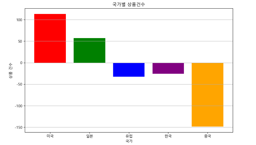
반응형
댓글